IT Budget Monster Campaign for Apptio
An fun ad campaign for the multinational technology budget and planning company.

The Challenge
Apptio had spent the last 12 years creating the Technology Business Management category and building a solid base of loyal customers. As they continued to expand, the company needed to refresh their brand with a consistent visual concept that could grow and evolve with the company.
The Solution
I collaborated with multiple teams and groups across the organization to develop a system of fonts, colors, visuals and templates that could be applied to web pages, digital assets, events, printed content and even Apptio’s products. The result was a cohesive brand across the entire company.

I approached the project by meeting with teams across the company to understand their needs and limitations. I also worked with account managers and other customer facing teams to see what resonated in the market. With knowledge of the practical aspects of how the company operates (team sizes, project volumes, etc.), I set out to create an outstanding visual brand system.

Lato was chosen as the corporate typeface for the brand. As an open-source font, Lato could be easily distributed and applied to different applications and mediums without incurring a large expense. Lato is a humanist typeface with a clean and clear look, making it ideal for presenting data and information.

Data visualization is a vital part of Apptio’s products and the product team required a large color palette to clearly present data. The social team also requested multiple color options to use online. With those requirements in mind, an extensive color system was developed. This allowed the team to create a core palette of colors that was used for our daily projects, as well as creating custom color palettes from the color system for special projects and events.
A standard library of icons was developed and applied across all of Apptio’s products, web and marketing assets.

The team developed standard methods for data visualization, tables and diagrams creating consistency in the way Apptio’s customers see their data, outcomes and reports.

Apptio’s products handle massive amounts of data and allow customers to view that data at a high-level or drill down and focus on specific pieces of data. With data being so important to Apptio’s products, a primary brand visual, nicknamed “data art”, was developed that represented this data in abstract/interesting ways.

A set of brand guidelines was created so the entire company and outside vendors could easily align with the refreshed brand.

Extensive content templates were created. These templates included a versatile grid system and guidance for type treatments and sample layouts. This allowed the creative team to easily flow in copy, giving them more time to focus on the compelling visuals.

These content templates also allowed for pull quotes, large stats, photography and other elements that would add variety and interest to the pages of text.

Templates for social media were also created to promote events and content across different online platforms. These social media designs were also a great place to showcase different interpretations of Apptio’s “data art” visuals.

A series of posters representing Apptio and each of the company’s products were created and displayed in office meeting rooms and at events.

Trade-show and event booths were an eye-catching opportunity to showcase the brand’s bold color palette and visuals.

Pull-up Banners were created to ensure that Apptio had a strong brand presence at smaller events and meetings.

Custom apparel was created so Apptio employees could quickly and easily be identified at events.
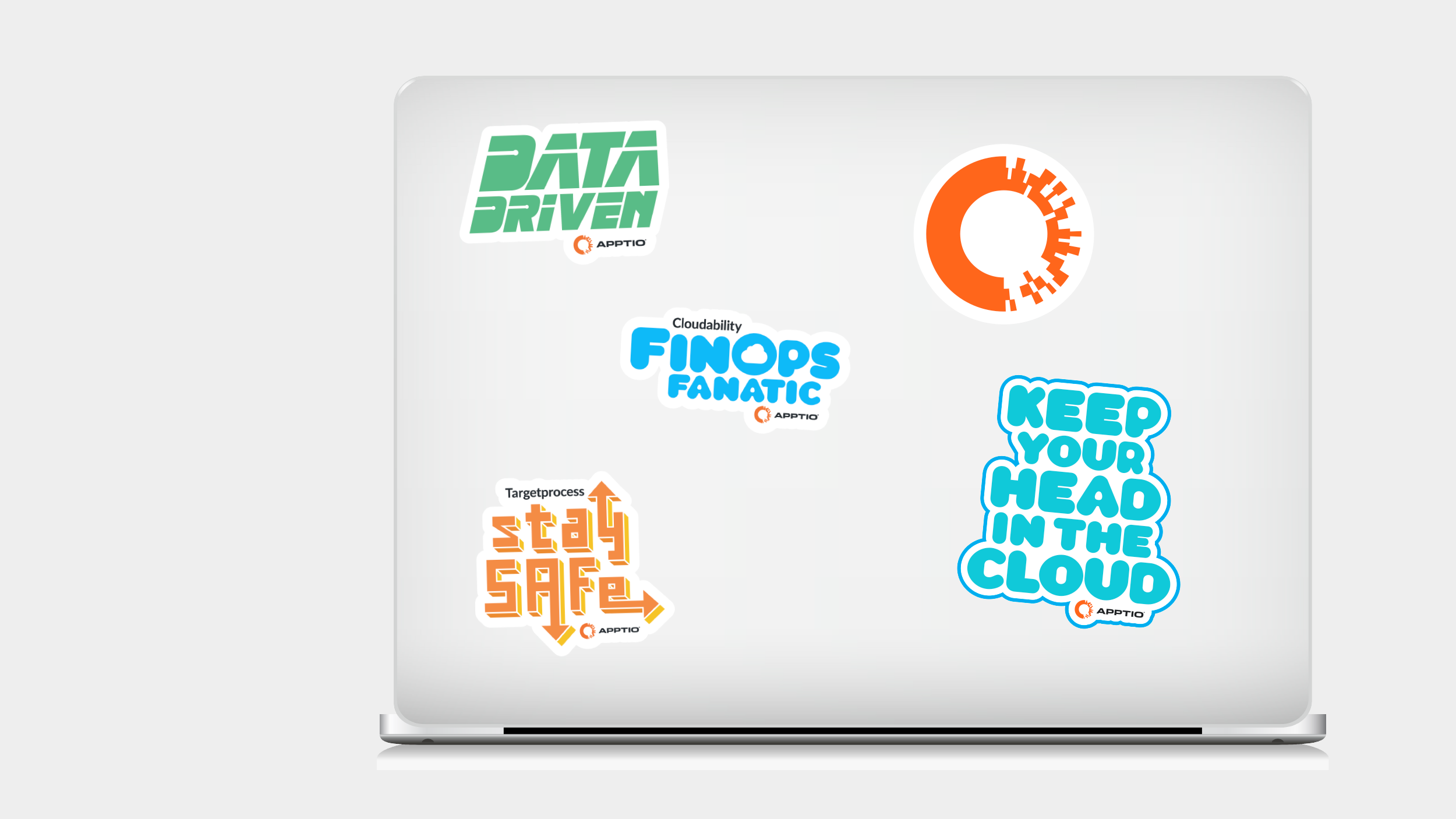
Stickers and swag were designed and given out at trade-shows and events allowing customers to showcase their love for Apptio products in a fun way.

A brand campaign was developed, nicknamed “the human side of data”, this campaign used halftone portraits of customers to show how Apptio’s products bring all of our customers’ data together to work for them.

Large banners using the brand campaign visuals were created and displayed at trade shows and other events to promote Apptio and their products.
A video was created to visualize the brand message and bring the problems that Apptio’s customers face to life.
Contact